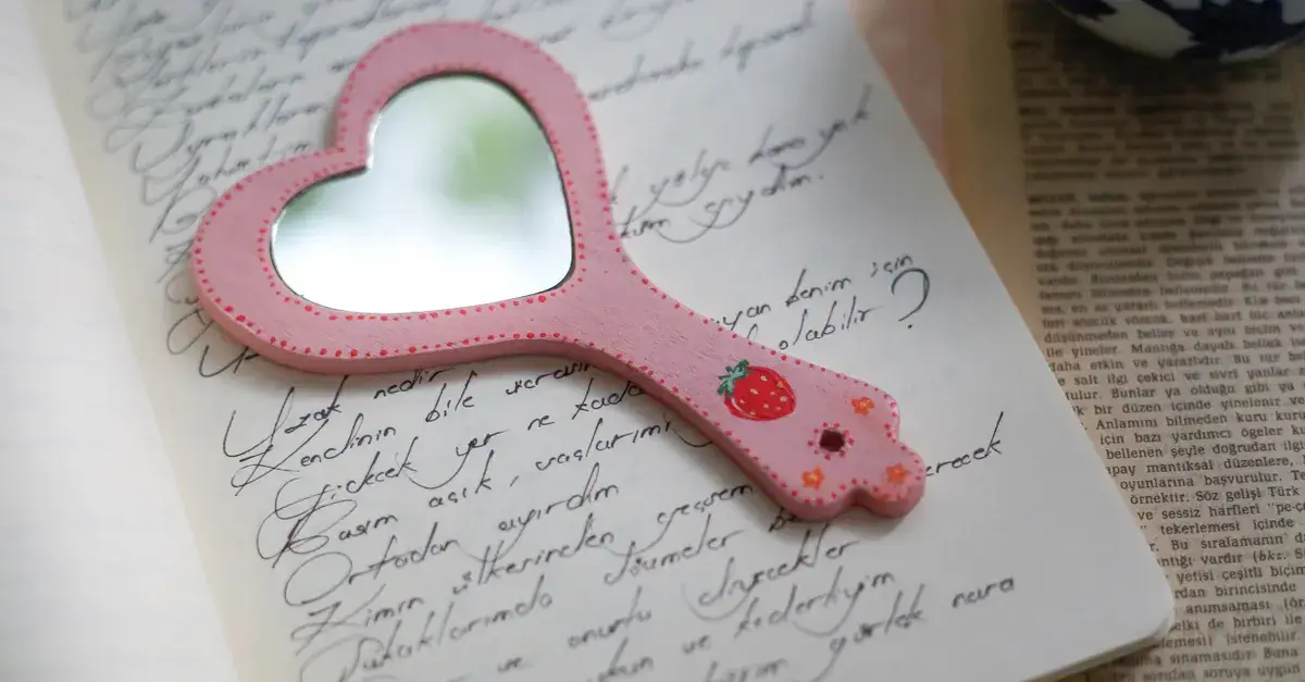
Choose a background based on contrast and mood, not just personal meaning: pick an image or color with enough tonal difference from your text, and let its mood match the occasion, then treat any photo as a supporting layer rather than the main event.
Why does the background matter as much as the words?
A poem plaque is read, not just glanced at. If the background is busy or low-contrast, even a well-written line becomes hard to follow.
The background sets the first impression before anyone reads a word. A soft, muted scene reads as calm and reflective. A warm sunset tone reads as romantic. A plain, deep color reads as formal and steady.
Should you use a photo, a scene, or a plain color?
It depends on what you want the viewer to notice first.
- A plain or gradient background keeps full attention on the poem, which works well for memorial or formal wording.
- A landscape or nature scene adds atmosphere without competing, especially for anniversaries or home décor pieces.
- A personal photo adds recognition and warmth, but only if the poem's text sits over a calmer part of the image.
How do you know if a photo is too busy for text?
Look at the area where the words will sit, not the whole image.
A photo can be visually rich in the corners and still work, as long as the section behind the poem is relatively even in tone and free of sharp detail. If every part of the image is equally detailed, the text will struggle no matter the font choice.
How do you match a background to the occasion?
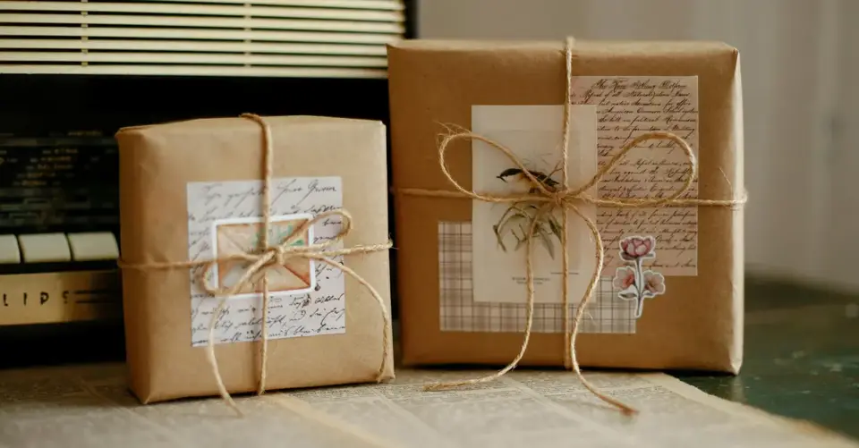
Start with the feeling you want the piece to carry, then look for a background that supports it rather than announces it.
- Memorial pieces often work best with soft, muted, or neutral tones that feel steady rather than dramatic.
- Wedding or anniversary pieces can carry warmer light, golden tones, or a quiet outdoor scene.
- Nursery or new baby pieces suit lighter, gentler palettes that won't overwhelm a small room.
- Home décor pieces for a specific room benefit from colors that already sit near that room's existing palette.
What if you want to use a personal photo?
Choose a photo where the moment matters more than the background clutter behind it.
A close, simple photo usually works better than a wide group shot, because the plaque is small enough that fine detail gets lost. If the photo has a plain sky, wall, or water in part of the frame, that section is often the natural place for your poem to sit.
Can you try different combinations before deciding?
Yes. It helps to see the actual pairing rather than imagining it.
In the PlakYourPoem editor you can write or paste your own poem, adjust the text and fonts, and choose a background or photo before ordering.
Because you can swap backgrounds and adjust text placement in the same draft, it's worth testing two or three options side by side before settling on one.
You see a full preview of your plaque design before checkout.
Does the same background work for every poem length?
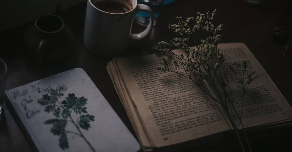
Not always. A longer poem needs a calmer, more even background so the extra lines stay readable, while a short line or single verse can sit comfortably on a slightly busier scene.
Should the frame or plaque material influence the background choice?
It can. Darker frames tend to suit richer, deeper background tones, while lighter frames often pair well with softer, brighter palettes. If you're unsure, a neutral background is the safer starting point.
What if the recipient already has a favorite photo in mind?
Start there. You can still adjust the poem's placement, font color, or size so it reads clearly, without abandoning the photo that matters most to them.
Where can you see examples before you start?
Looking at finished designs can make these choices feel less abstract.
The public gallery offers ready-made plaque designs you can open in the editor and personalize.
If you'd like to compare a few background and photo combinations for your own wording, you can browse the design gallery or open a blank layout in the editor to test your poem against different options directly.